Ten buildings that changed Melbourne while you were at home
By Rachael Dexter
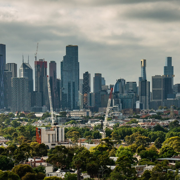
The view of Melbourne’s skyline from North Melbourne.Credit:Scott McNaughton
While the city was shuttered during the COVID-19 crisis and hundreds of thousands of people abandoned the CBD, one of the constants that remained was construction work.
Work on 109 developments was completed in the City of Melbourne over the three pandemic years of 2020, 2021 and 2022, and ranged from retrofits of Victorian-era chambers to some of Melbourne’s tallest skyscrapers. State planning ministers, not local councils, have ultimate power to approve Melbourne’s largest towers: anything with more than 25,000 square metres of combined floor space.
While most of the large developments completed in the past three years were approved by the Andrews government’s now-retired planning minister, Richard Wynne, some were delayed completions from Liberal Matthew Guy’s notorious era as planning minister between 2010 and 2014.
We asked five experts for their reflections on a list of 10 of these new builds, good and bad. The experts are RMIT emeritus professor of environment and planning, and former Victorian government planner Michael Buxton, adjunct professor of architecture at Monash University and principal architect Kerstin Thompson, urban designer and design advocate Andy Fergus, architect and public space advocate Tania Davidge, and Heritage Network Victoria founder Adam Ford.
Melbourne’s skyline has changed while the city’s workers were working from home, but the impact of these new structures is more than just visual. How have they changed the CBD and its surrounds?
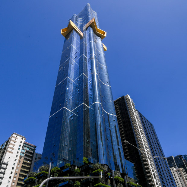
Australia 108 rises above Southbank.Credit:Justin McManus
Australia 108: ‘Glittering’, but not at street level
This enormous Guy-era tower has radically changed Melbourne’s skyline. It’s not only Melbourne’s tallest building (surpassing the nearby Eureka Tower), it’s the tallest residential building in the Southern Hemisphere.
This lavish development has two private infinity pools, a theatre and high-end restaurants all hanging above the city for residents and hotel guests. Its architect says it is “[rising] above Southbank’s glittering streetscape” and “[embracing] the limitless sky, revealing dramatic panoramas no one has ever seen”.
One of its most notable features — a yellow “starburst” two-thirds of the way up — is also described as “an exclamation mark in the sky, inspired by the Commonwealth Star on the Australian flag”.
But the roaring City Road that funnels trucks and B-doubles through Southbank, where the building’s street entrance is located, is not so “glittering”.
Architect Kerstin Thompson says the development’s “podium” car park contributes to Southbank feeling unsafe. There are no apartments anywhere close to street level.
“Too much of Southbank has been car rather than people-planned. It’s death by car parks,” she says.
RMIT’s Michael Buxton agrees, describing Australia 108 as one of a number of new buildings in Melbourne that has a “massive anti-people facade”.
“They’re uninviting and there’s no relation to the street. No shops, nothing for people to do,” he says. “They are massive structures that are designed to dominate. They’re designed to express corporate power.”
The designers of Australia 108 have at least adorned the car park levels with vegetation and integrated the heritage building that was previously on the site.
But otherwise, Thompson describes 108 as “a relatively conventional high-rise residential tower … with fully glazed curtain-wall facades and no outdoor space because of extreme height” — and points out that developments such as this rely heavily on the city to provide green space to its thousands of residents.
The 80 Collins development, which was almost a decade in the making.
80 Collins: Tight spaces deliver wins and losses
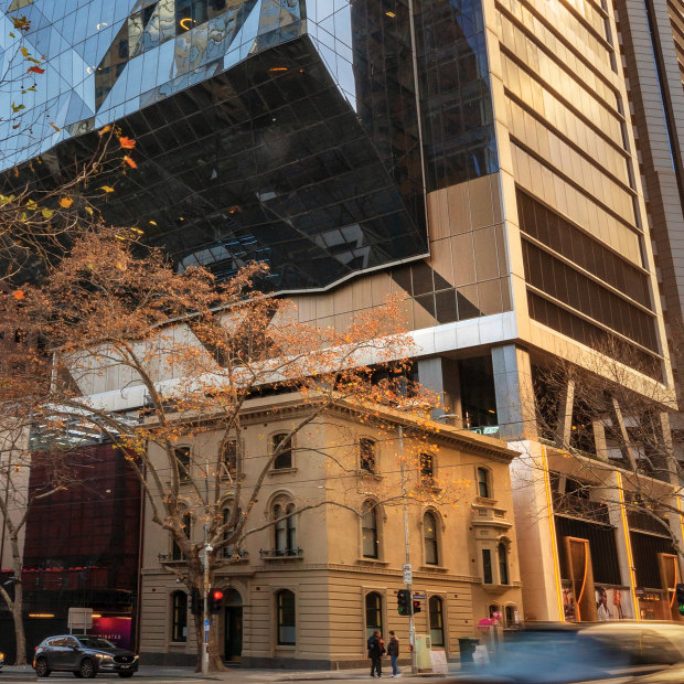
You’d be forgiven for not noticing from street level this mammoth development at the “Paris end” of Collins Street that teeters high above the former Commercial Bank of Australia (which houses a Rolex boutique).
But stand diagonally across the intersection of Collins and Exhibition streets and look up for the full effect: 47 floors of rippled glass wedge cantilevering over Collins Street within just metres of Nauru House, which has loomed over Exhibition Street since 1977.
The 80 Collins development – almost a decade in the making – spans nearly a whole block between Collins, Exhibition and Little Collins streets and Alfred Place, and includes a host of swanky luxury stores that cover up the dated facade of Nauru House, and new (privately owned) laneways with cafes and bars.
According to urban designer Andy Fergus, the new laneway spaces “feel tight, intimate and good in most climates”, but the project came at the loss of much-needed public space on Exhibition Street. Before-and-after photos show the loss of a public courtyard and open sunlight.
Fergus says newly introduced planning laws would have prevented this development proceeding in its now completed form. One of those rulings from the City of Melbourne requires revitalised plazas to have “good street address and sunlight access”, while another specifies minimum distances between towers.
“The distance between these towers (80 Collins and Nauru House) is something of the past, which would no longer be allowable,” he says.
Adam Ford, founder of Heritage Network Victoria, lambasted the loss of the Le Louvre Building (which dated to 1855 and was one of Melbourne’s oldest retail buildings) for 80 Collins after a late application by developers to the Planning Department.
“[This led] to an abysmal outcome with a wholly newly constructed side wall that doesn’t even attempt to recreate the historic form,” he says. “And this was approved without any public input.”
The Gothic Bank refurbishment at the corner of Queen and Collins streets.Credit:Scott McNaughton
Queen & Collins: Exciting complexity no mean feat
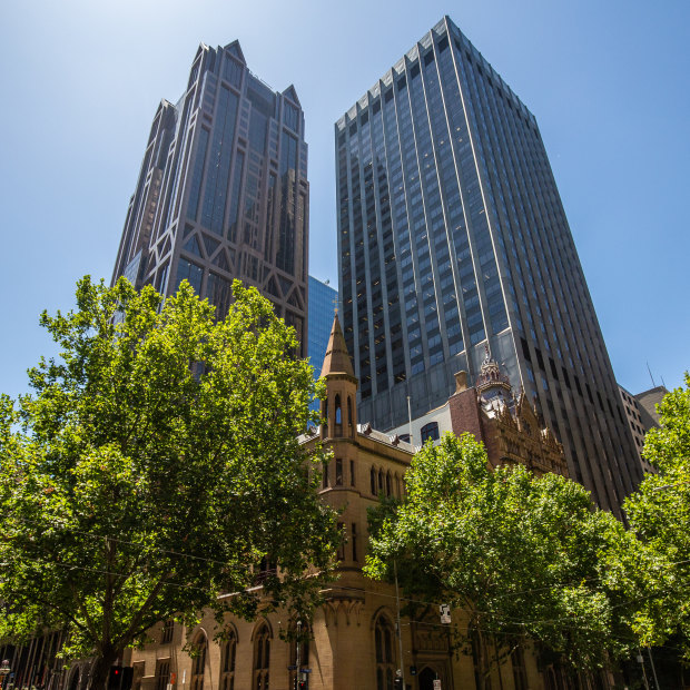
This development, described as “a city within a city”, is not a new building per se but a reimagining of some of Melbourne’s oldest and most beloved buildings. The refurbished Queen & Collins is a cluster of four buildings: the historic Gothic Bank (built 1883-87), the former Stock Exchange building (built 1888-91), the former Safe Deposit building (built 1890) and the 34-storey ANZ skyscraper (built 1993).
Stepping into the Gothic Bank (voted Victoria’s favourite building by Age readers in 1987) from Collins Street is like stepping back in time, with its imposing ceilings and historic teller windows, but meander through the refurbished open-air complex, and you discover quiet Venetian-inspired courtyards, bars, a banking chamber being converted into restaurants, and meeting rooms with plush orange and purple interiors.
The funky fit-outs have attracted companies such as Afterpay to quickly take up residence in old buildings – no mean feat, according to urban designer Andy Fergus.
The banking chamber, with its dramatic ornate vaulted ceiling, will be occupied by the restaurant NOMAD.Credit:
“This project epitomises the demands placed on an office building in 2023, which needs to provide exceptional amenity and ground-level uses for workers and visitors to attract people back into the city,” he says.
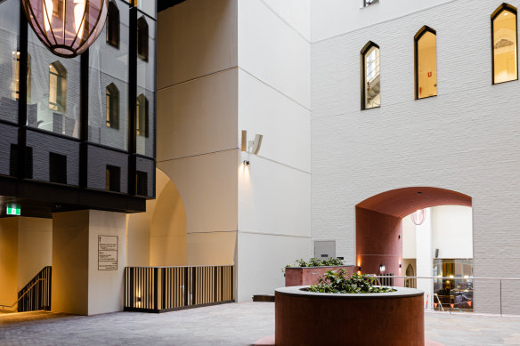
“Working with some of Melbourne’s most extraordinary Victorian heritage, and some of its quirky 1990s architecture, this project creates a series of beautiful new courtyard rooms, with laneways and urban stairs, while shrinking the private lobby down to the bare minimum.
“We can only hope that this ushers in a new era where the ‘empty glass lobby with sultry corner couches’ is banished, and urban life is welcomed back into the ground floor of office development.”
Architect and public-space advocate Tania Davidge says it will take time for the development to establish its character, and many of the ground-floor shopfronts are yet to open.
“However, it is already showing its potential,” she says.
“I enjoy the way new Melbourne draws inspiration from old Melbourne. There is a richness to the spaces. At the moment, these spaces feel quiet and reflective. However, I imagine once the retail and hospitality is fully open, the spaces will be entirely different.”
The Olderfleet tower behind 19th century gothic buildings on Collins Street.Credit:Scott McNaughton
Olderfleet: The best or worst of facadism?
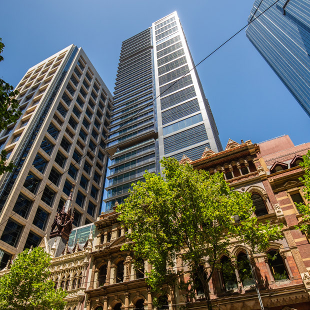
At the centre of the Olderfleet development is a 40-storey glass tower, which rises behind three Victorian-era buildings that have stood on Collins Street for more than 130 years. It replaces a low-rise tower that was built in 1980.
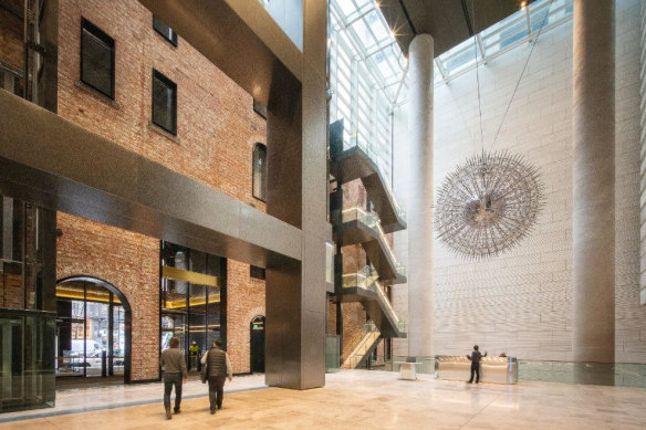
The new development, completed in September 2022, retains the original 1889 Venetian gothic facade, but visitors walking in through the threshold from Collins Street arrive inside a cavernous 25-metre-high, light-filled glass atrium. There’s not much left to signify this building’s heritage beyond the facade, apart from a small lobby display about its storied history, including the wild escapades of the building’s runaway clock, documented in The Age in 1985.
A soaring modern lobby fills the space immediately behind the 1889 brick facade of the Olderfleet building.Credit:Mirvac
Buxton, who worked in the older office buildings for a decade, says this type of development “illustrates the worst of facadism”.
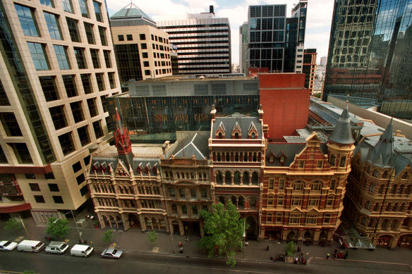
In the 1980s, a low-rise office building behind the Victorian-era Olderfleet chamber was agreed to as a compromise as part of the Rialto tower construction. Because the Rialto tower was so high, any development behind the Olderfleet needed to be discreet, according to Buxton.
“But what’s happening now in Melbourne is that developers are going back 30 years later revisiting those original compromises,” he says.
The previous low-rise building behind the heritage buildings, pictured in 2006.Credit:Mark Wilson
“It’s really plundering every square metre of the city that can be plundered for high-rises, no matter what pre-agreements were reached.”
But Ford describes the development as a heritage facade done well.
“It highlights the fact that if you get your street and heritage interfaces right, that it doesn’t matter how giant a tower you build behind it. Five storeys is the same as 50 storeys as far as the human interfaces are concerned,” he says.
“Melbourne’s deep city blocks allow for exactly this sort of textbook high-density redevelopment, and it’s to the city’s eternal loss that these same sort of opportunities weren’t realised one block down between King and Spencer streets, where so many buildings that would have supported this approach were demolished in the ’60s and ’70s.”
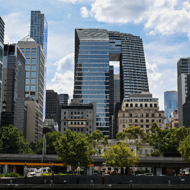
Collins Arch, also known as the “pantscraper”, as seen from the Yarra River.Credit:Joe Armao
Collins Arch: ‘Pants gap’ proves inviting
Melbourne’s big glass pair of pants – or Collins Arch – is a twin set of towers joined by an eight-level sky bridge. While its views of Southbank are spectacular — and the building itself is striking when viewed from over the Yarra River — at street level, the building feels similar to many other glass office buildings until you look up.
One of the development’s touted benefits is a rare CBD lawn, which at lunchtimes is peppered with office workers snacking and chatting cross-legged on the ground. Before and after photos of the site remind us of a huge public forecourt that used to occupy much of the site.
But developers of Collins Arch maintained some public space between the “pant legs”, working with the council to install a garden area on Market Street from repurposed car parks and creating a thoroughfare.
“It’s open to anyone to meander through, take a shortcut … so it’s not an urban ‘blocker’,” says architect Kirsten Thompson.
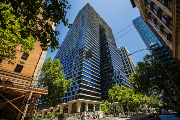
A view of Collins Arch from street level.Credit:Scott McNaughton
Davidge says open space in the city is so rare “primarily because Robert Hoddle divided up the city with little regard for public space”. She describes Collins Arch as “a wonderful example of how better public spaces can be created when the public and the private sector work together”.
But Ford describes Collins Arch as “easily the worst tower approval in the past decade”, decrying its “oddly proportioned” top levels and “squat bulk”.
“A classic example of a building which looks great on paper, but as it’s been realised – built with cheap, shoddy materials and relying entirely on a gimmick for its architectural worth – a great reckless and misshapen mess has been foisted on arguably the most prominent part of the entire city’s skyline.”
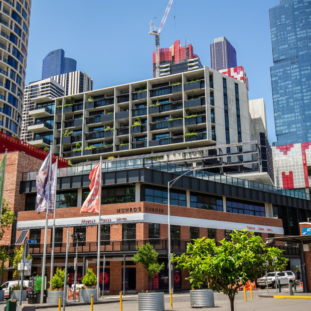
The Munro development at Queen Victoria Market.Credit:Scott McNaughton
Munro development: Variety and a more human scale
The controversial development that attracted headlines for years during Robert Doyle’s time as lord mayor has almost reached completion. Two cylindrical skyscrapers just at the edge of the low-rise historic market are the most obvious change to the area, but the development also includes a library, pubs, bars and restaurants.
There’s a slightly disjointed feel to Therry Street, which is dominated by the towers – the glossy reception for the boutique hotel and rental apartments is just metres from the gritty (and pungent) edge of the market, and many of the retail and dining spaces around the redeveloped block are either still in construction or sitting empty.
Nonetheless, Fergus says the strengths of this development come because of the input from several architects, which “avoids a monolithic gesture” in favour of buildings of a variety of types and sizes.
“This project is broken down into a series of urban buildings, including the retained old Mercat Cross Hotel, which provides a wonderful human scale to the edge of the market when viewed at near range,” he says.
“The new crafted brick buildings at the street edge are pierced with a series of lanes and arcades, which connect through to a new plaza to the rear of the site.”
Fergus’ only complaint about the site is the 500-space basement car park “in a city otherwise trying to shake off a legacy of car-centric planning”.
Davidge lauds the development’s social and affordable housing, but Buxton is more cynical of their inclusion in the towers.
”It speaks to a common principle of justifying high towers by adding other elements that claim to benefit the community – this was actually built into the very notion of amendment 270, which was Richard Wynne’s planning scheme for the CBD where you could have trade-offs: if you provide ‘community benefit’, you can have a higher building.
“Community benefit is a very subjective term, and developers find ways to define community benefits that are commercially beneficial to them. They’re very good at it.”
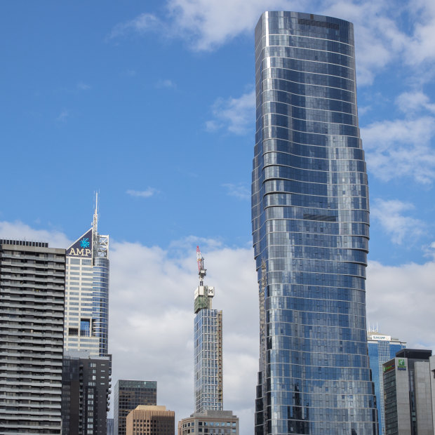
Premier Tower, on the corner of Bourke and Spencer streets, Melbourne.Credit:Simon Schluter
Premier Tower: Beyonce-inspired skyline novelty
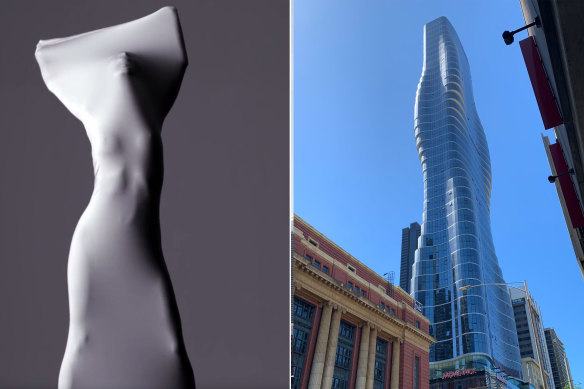
Returning to the theme of skyline novelty, those who spend time in the south end of the CBD will know the so-called Beyonce building – its curvy design inspired by the female form on display in the video clip for the singer’s song, Ghost.
The soaring tower replaced the bottom-end drinking hole the Savoy Tavern soon after it was renovated after being dubbed “a scab on the city”. The glass podium at the bottom of the new tower houses Movenpick Hotel, while the rest of the building is apartments.
Architect Kerstin Thompson says the building’s curvy silhouette offers apartment variety and different floor plans, making it “more purposeful than a flat facade variation”.
But apart from that, this tower — designed before the COVID-19 pandemic — has the same issues identified in others of the era: lack of balconies or outdoor space. Like several other new Melbourne CBD high-rise buildings, including Australia 108 and Melbourne Square, Premier Tower has been identified as having creaking sounds in high wind. Developers say that is a sign that the building is doing its job.
The Premier Tower on Spencer Street was inspired by the music video for Beyonce’s song, Ghost.Credit:Jane Richards
The COVID-19 era has radically changed the demand Thompson’s firm is seeing for outdoor space in apartments or at least winter gardens.
“Those without outdoor space will be arguably less desirable, less enduring in the future,” Thompson says.
The corner block, which for decades was a drop-in spot for people to meet and drink at the pub, has been replaced with a ground-level restaurant, chocolate shop and ice-cream bar.
Ford is blunt in his verdict on Premier Tower. “It’s effectively a multimillion-dollar artwork sitting on top of a cheap cardboard box,” he says.
“City of Melbourne have since amended their policies on street interfaces, but they also bear some responsibility for approving this building’s bland, artless, design-free zone of a podium, which is the context in which most Melburnians are forced to have to relate to it.”
Melbourne Connect was built on the site of the old Royal Women’s Hospital in Carlton.Credit:Joe Armao
Melbourne Connect: A different view from every approach
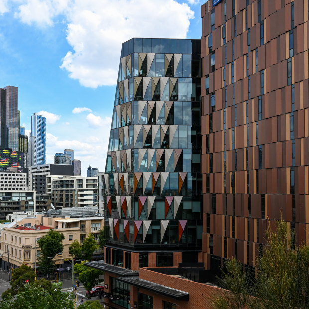
In a sea of similar glass buildings, Melbourne Connect is a reminder that new buildings can still be built with brick.
On the site of the former Royal Women’s Hospital and designed by an architecture collective, the development is three buildings around a central courtyard where uni students lounge on bean bags surrounded by greenery.
Your view into the “shard-like” buildings depends on the direction from which you approach them: in one window, you see a laboratory; in another, a cafe; in another, children at daycare.
Despite being larger than anything nearby at the top end of Swanston Street (including an ugly multi-level car park across the road on Grattan Street), the development is “streets ahead of anything else on the list”, says Buxton, because it is built “more at human scale”.
“It’s not trying to cram as much as possible onto the site,” he says. “It’s actually creating an area that people can use.”
But Fergus, while lauding the mixed use of the space, says he is “saddened” by the way the “mega structures” blend in surrounding the courtyard.
“It suffers from feeling like an atrium cradled within a single large building mass rather than feeling like a square with a collection of buildings of different sizes at its edge,” he says. “It feels more familiar to contemporary hospital environments rather than a piece of the city.”
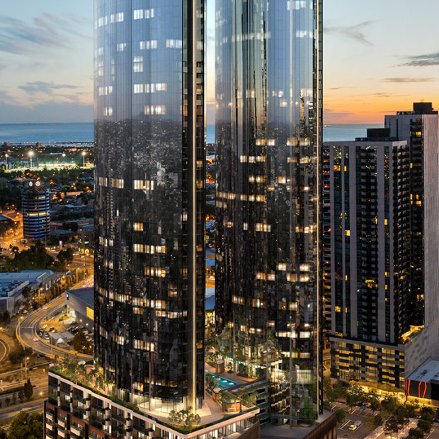
Two of six towers that will be built at Melbourne Square.
Melbourne Square: The new kid on the block
Overlooking the M1 freeway and Kings Way, the two completed Southbank towers at Melbourne Square feel remote despite being so close to the CBD. It’s an eight-minute walk to any type of public transport, which often involves crossing busy major arterial roads. The large open sites on either side of the towers are being built up for car parks.
Thousands of people who live in these looming towers shop at an in-built supermarket and there is an on-site childcare centre. But green space at the front of the building, while much needed, seems for now potentially more popular with residents’ dogs than the public – if the yellow patches on the lawns are anything to go by.
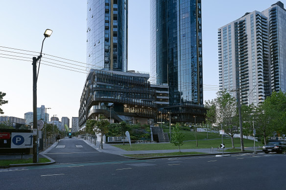
The ground-level view of the Melbourne Square development in Southbank.
Fergus says the development risks feeling like a resort, with the building’s internalised supermarket not very inviting for the general public.
“They’ve created all this amenity and space by setting the building back, but in doing so it feels almost like an isolated citadel on a hill away from the street,” he says. “It does feel like a significant barrier to the neighbourhood to walk all the way up and use the supermarket or cafes.”
Thompson says that, in theory, the “unravelled” podium in this development “rethinks the relationship between tower and ground” and encourages people to walk instead of using a lift via a zigzagged garden to reach the building and its eateries.
But much of the advertised retail space is empty. “That’s a long way to walk for no reason,” she says.
Fergus agrees, but says judgment on the site should come once it’s complete.
“The thing that will transform the site is once it has office space on it, then it goes from being a dormitory to having a daytime life, and the space will be used much more,” he says.
Wesley Place towers over a historic church on Lonsdale Street.Credit:Scott McNaughton
Wesley Place: Rising up, with mixed blessings
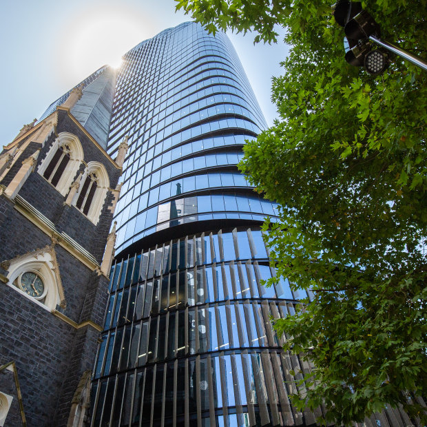
Last on the list is one of the most striking — an enormous glass office tower built within metres of the 165-year-old Wesley Church at the top end of Lonsdale Street.
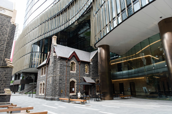
Wesley Place is the largest office precinct in Melbourne’s CBD, and notable for the unearthing during construction of some of the oldest remains of early settlement in Melbourne – some artefacts are encased in glass in the lobby.
While its developers boast of how the site integrates heritage into its design – building the tower, for example, over the top of a heritage neo-gothic building built in 1859 – Buxton says the idea that such a large tower would be placed right next to a historic church would not fly in other cities around the world.
The Manse cafe, inside a heritage neo-gothic building underneath the new tower at Wesley Place.Credit:Samara Clifford
“When you look at European cities with cathedrals, or in China and India – this sort of thing just isn’t done,” says Buxton, who spoke out in opposition to the development before it went ahead.
“What would people think if all the forecourt of St Patrick’s Cathedral was filled with a high-rise?” he says.
There is still a grassy public area on the site, but with another large development going up on Bennetts Lane, the spot will be surrounded by towers on all sides.
“There were a number of historic buildings (including the Princess Mary Club built in 1926) on this block, and a large area of open space which was being used as a car park but could have been refurbished as a much-valued inner-city park, for example,” says Buxton.
The planner describes Wesley Place as “detrimental, and a most unfortunate example of what not to do”, and Ford agrees.
“The new buildings loom oppressively around the retained former church manse, and neither respond to nor effectively contrast with its bluestone gothic form and steeply pitched roof,” he says.
“It would have been better without the distracting vertical fins surrounding the heritage building.
“The Heritage Council thought this was a prize-winning example of how to do redevelopment within a heritage context, but I’m afraid I disagree.”
Credits
Reporting: Rachael Dexter
Visual production: Matt Malishev
Video: Margaret Gordon
Production and editing: Eliza Sum, Selma Milovanovic
Editor: Mark Fuller
The Morning Edition newsletter is our guide to the day’s most important and interesting stories, analysis and insights. Sign up here.
Most Viewed in National
Source: Read Full Article
